A personal project of simulated design for an information management system for "Open Textile"
My Role
User Research
UX&UI Design
Prototyping
Duration
A Month
Tools
Overview
Open Textile is a company that imports and markets textiles and housewares. The company has three branches and a central inventory warehouse located in Jerusalem and the surrounding area. As part of the project, I planned a dashboard for managers based on the information system with which the business works. The goalof the dashboard is to support managerial decisions by making the data available for viewing to company executives. For the system, I chose the name – Open Board.
The Problem
Unavailable business data
After several meetings with business executives it became clear that in order to make decisions and draw conclusions about the future of the business, the company relied on data emerging from reports produced from the system in a cumbersome and complicated way as well as “gut” feelings arising from executives ’business experience. Currently, in order to get reliable information about business performance in terms of sales, employee tracking, and inventory management, managers need to delve deeper into the system and pull out reports whose simulation does not allow them to read the full picture at a glance. In order to make strategic managerial decisions, the information needs to be accessible, understandable, and clear to business executives.
User Research
Inventory management systems are mostly similar
From the research I conducted the main competitors work with an inventory and sales management system similar to the business I am researching. In these systems, one can access each item in the database or each item in stock and receive information about it, such as item name, size, cost price, sales price to the customer, and more. In addition, one can also get information on the execution of the branches and employee reports, including item sales, item sales per employee, working hours, financial income, and more like. The information is displayed for selection in a daily/monthly or annual view. Most of the systems are presented in a basic and outdated visual way and can be significantly upgraded to get more convenient, efficient, expanded, and accessible use. I conducted a short survey on this topic that included a number of questions to get an answer to the same problem.
Survey Results
Based on the research I did, these are the main findings:
%
of respondents stated that the system with which they work today is outdated, cumbersome, and inconvenient to use
%
of the respondents stated that the system data is not presented consistently and clearly and in order to find data, they have to dig deep into the system
%
of respondents stated that they experience difficulties locating or searching for business data in the system. Which makes it difficult for the business to run properly
%
of respondents indicated that they want a dashboard for their business that will complement the limited operations of the existing system and present the information consistently, accessible and clear
User Persona
Based on the research, I developed user persona to relate to in the process:
Rafi Ohayon, 36
VP of Open Textile Company
Goals : • He wants to monitor data comprehensively from a “top view” across the economic and organizational conduct of the business. • He prefers to make strategic decisions based on real-time data rather than dig deep into the system.
Pain Points : • In the past, decisions were made that were not based on truthful data and led to wrong decisions. • In order to extract information, he must use complex queries in the information system and read cumbersome reports that do not present a picture as a whole.
"Businesses simply work better when data is consistently accessible"
The Solution
Making strategic decisions and segmenting data in real-time
Based on the above information and the fact that company executives encounter great difficulty, complex and cumbersome to locate data, I decided to build a dashboard system that will address managers and allow them to access information much more conveniently, make real-time strategic decisions and segment them for sound business management. It will be possible to obtain various estimates that will be presented in convenient charts and graphs for monitoring and analysis, thus making the right data-based decisions and improving the conduct of the business as a whole.
Target Audience
Company executives and branches. Managers who want a solution for tracking business data
The Value
These managers enjoy a continuous data tracking experience through a convenient and strategic interface
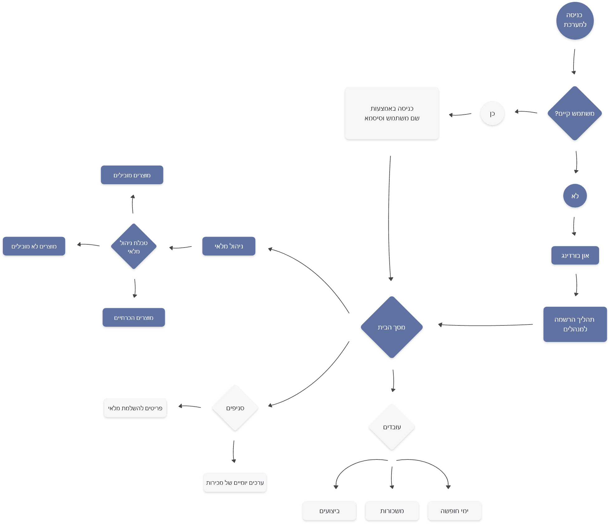
User Flow Diagram
The way to make business decisions
Based on the research, I detailed the actions that managers perform and the actions that are important to them in running a business. After I finished I worked on the user flow diagram.
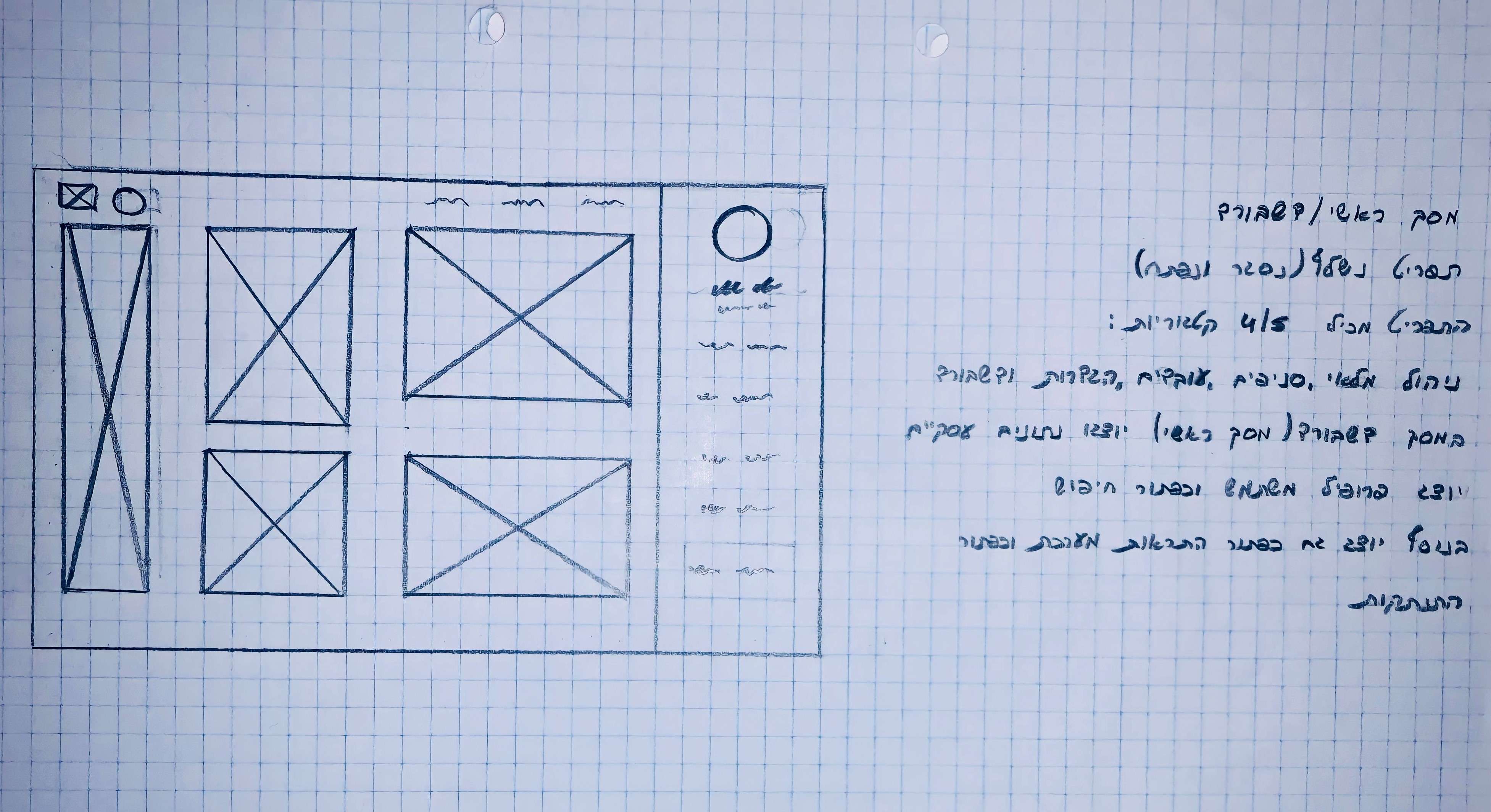
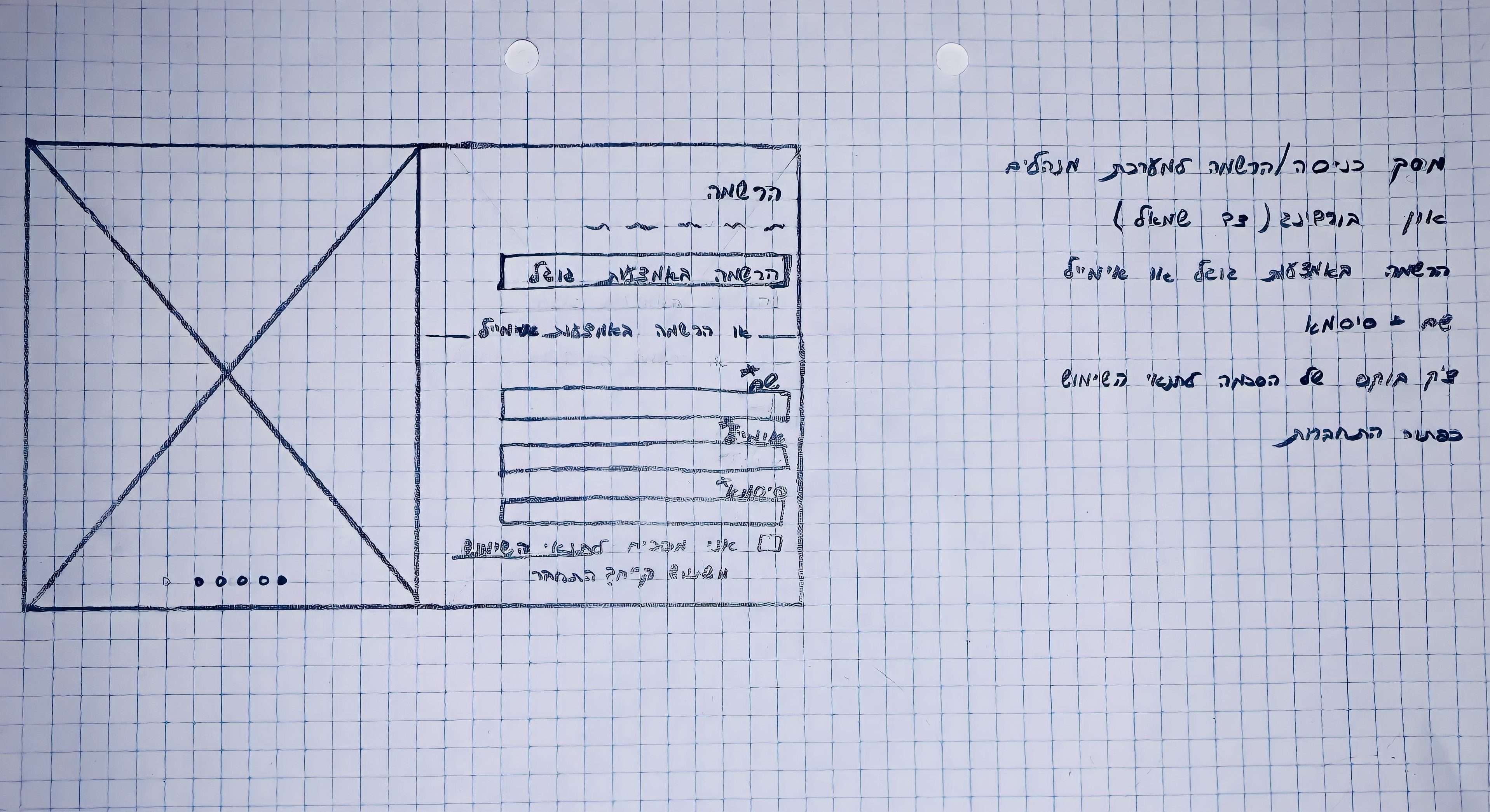
Wireframes
The planning stage
The next step was to work on the user interface itself. I started with the base and drew dashboard screens on a page. Next, I created low-fidelty screens in Figma and so basically moved slowly and safely between stages until I created a prototype.
User Interface
Interface design with delicate colors
I chose a clean and simple design and subtle colors that would make the interface feel comfortable to use. My goal was to get the user to connect to the interface, to understand and navigate throughout its use.
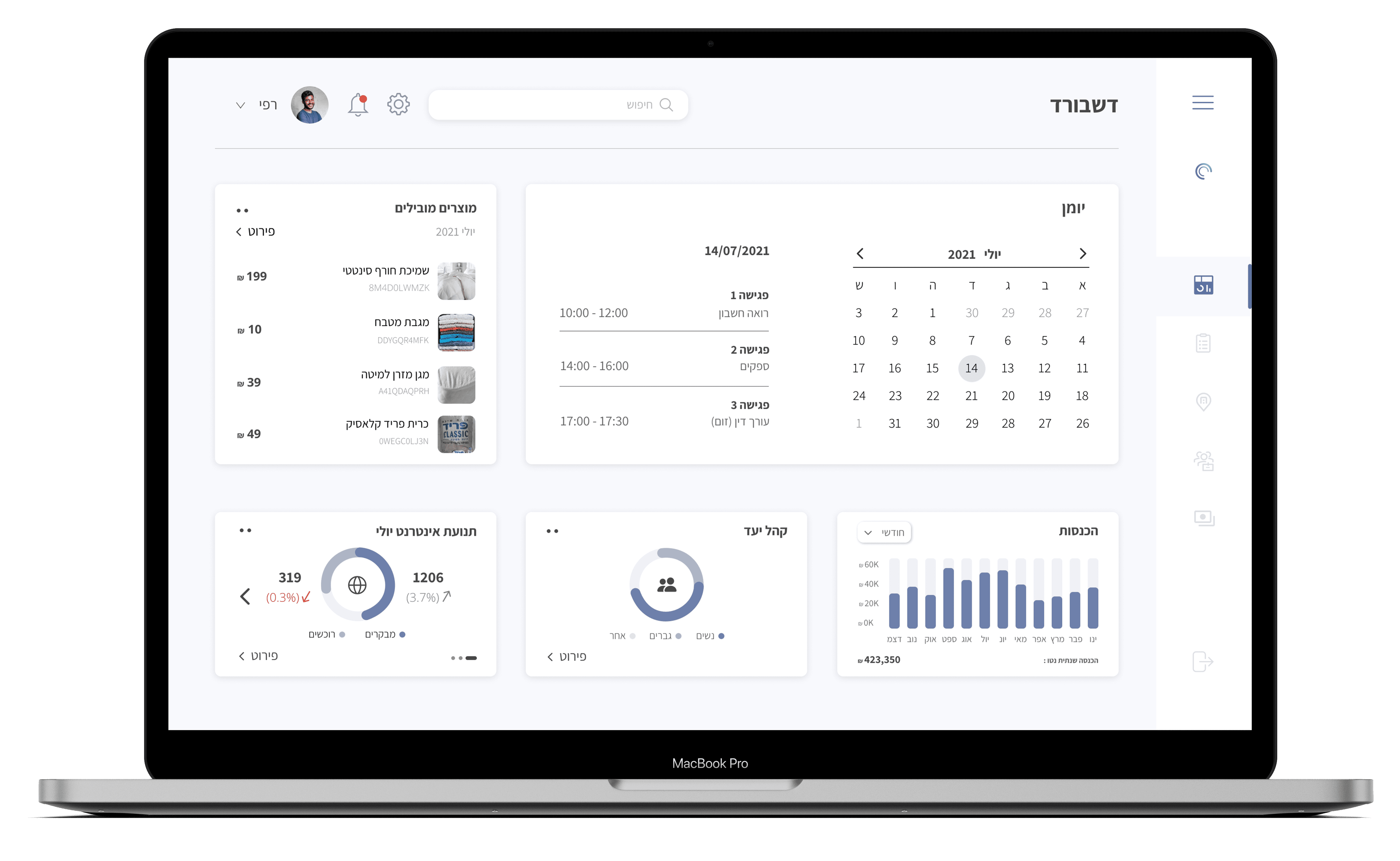
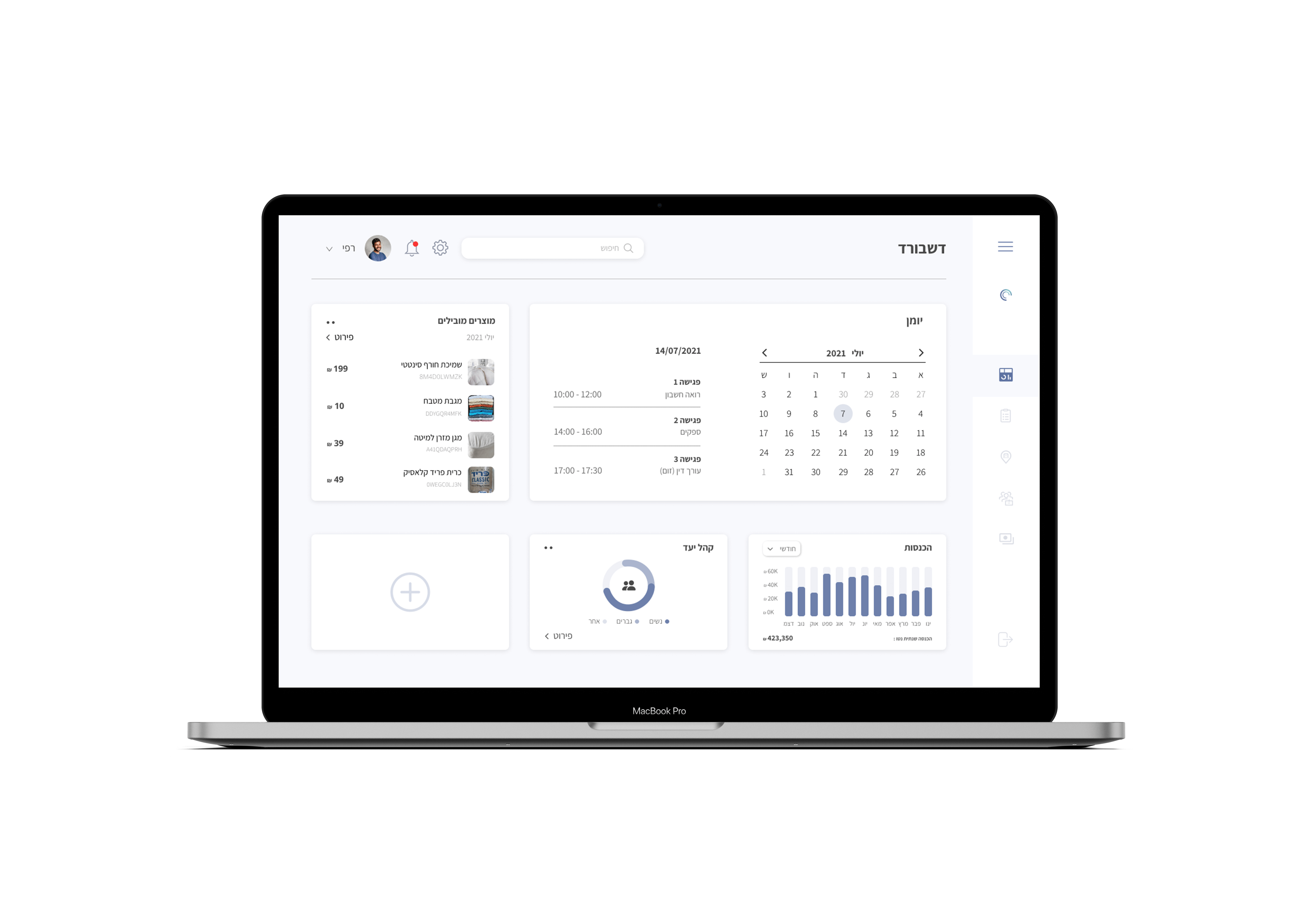
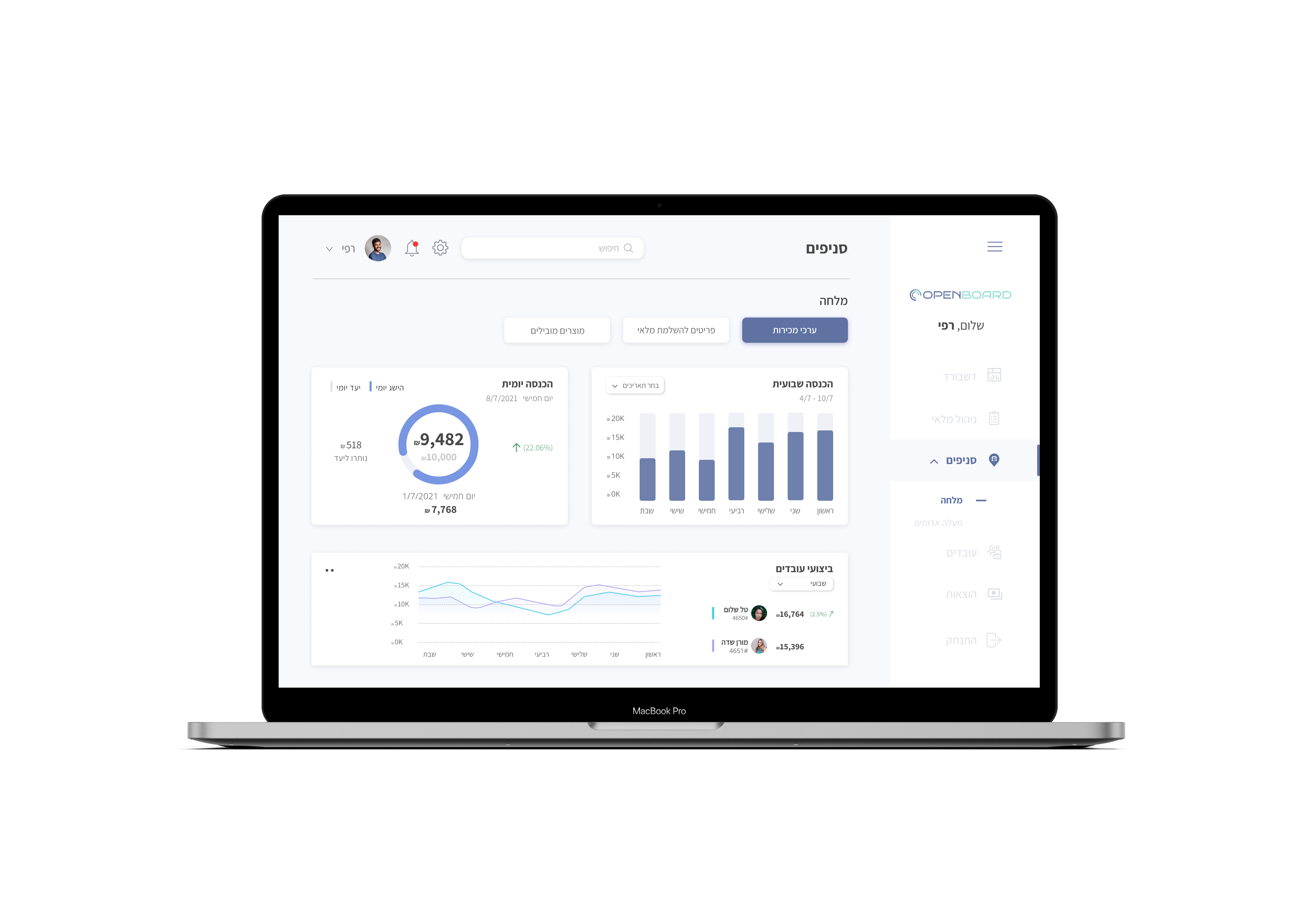
Homepage & Dashboard
The home page is basically the dashboard itself from which the user can navigate to any category and easily navigate the interface.
I chose to give the user the option of an open menu and a closed menu so as not to cause congestion.
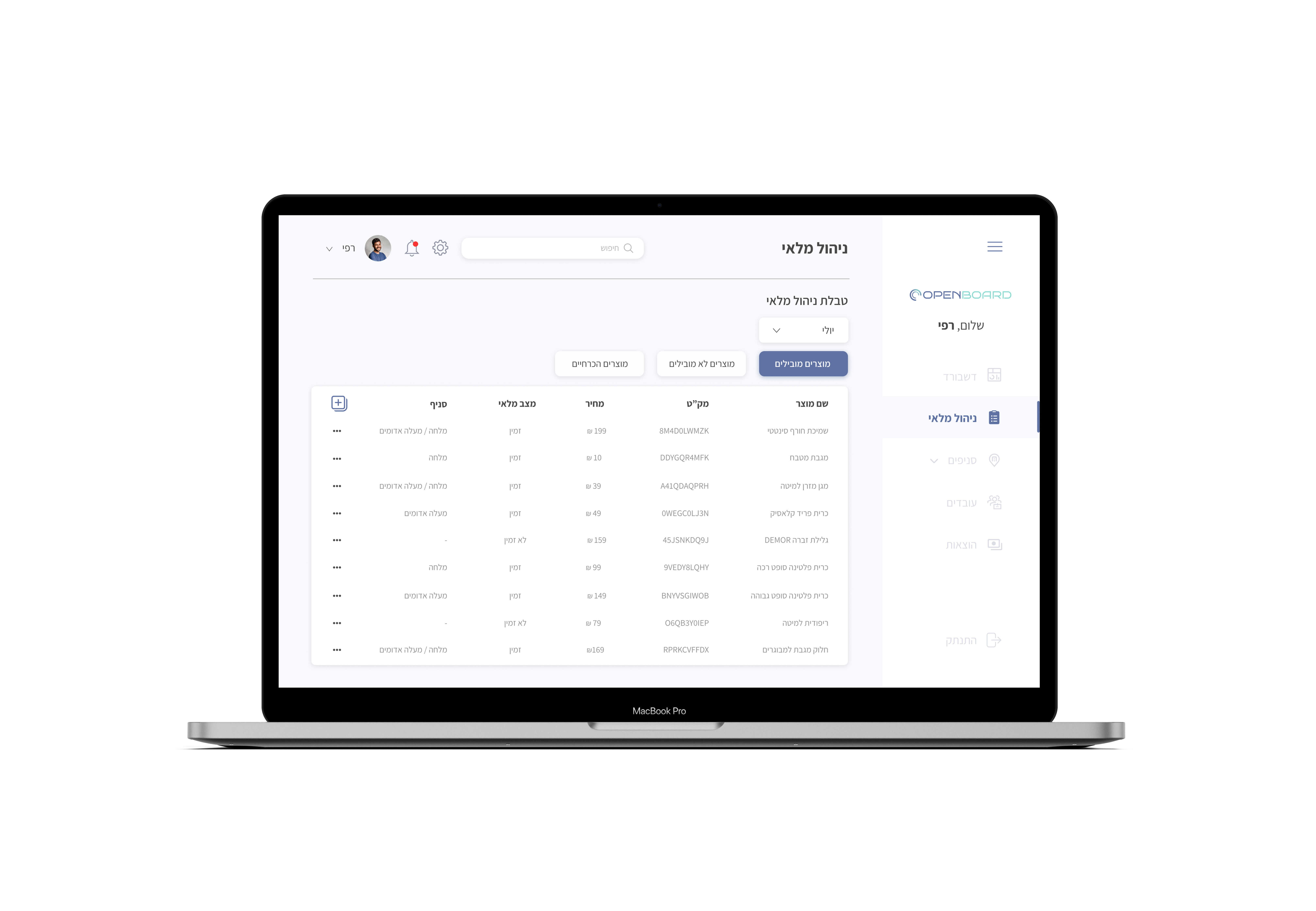
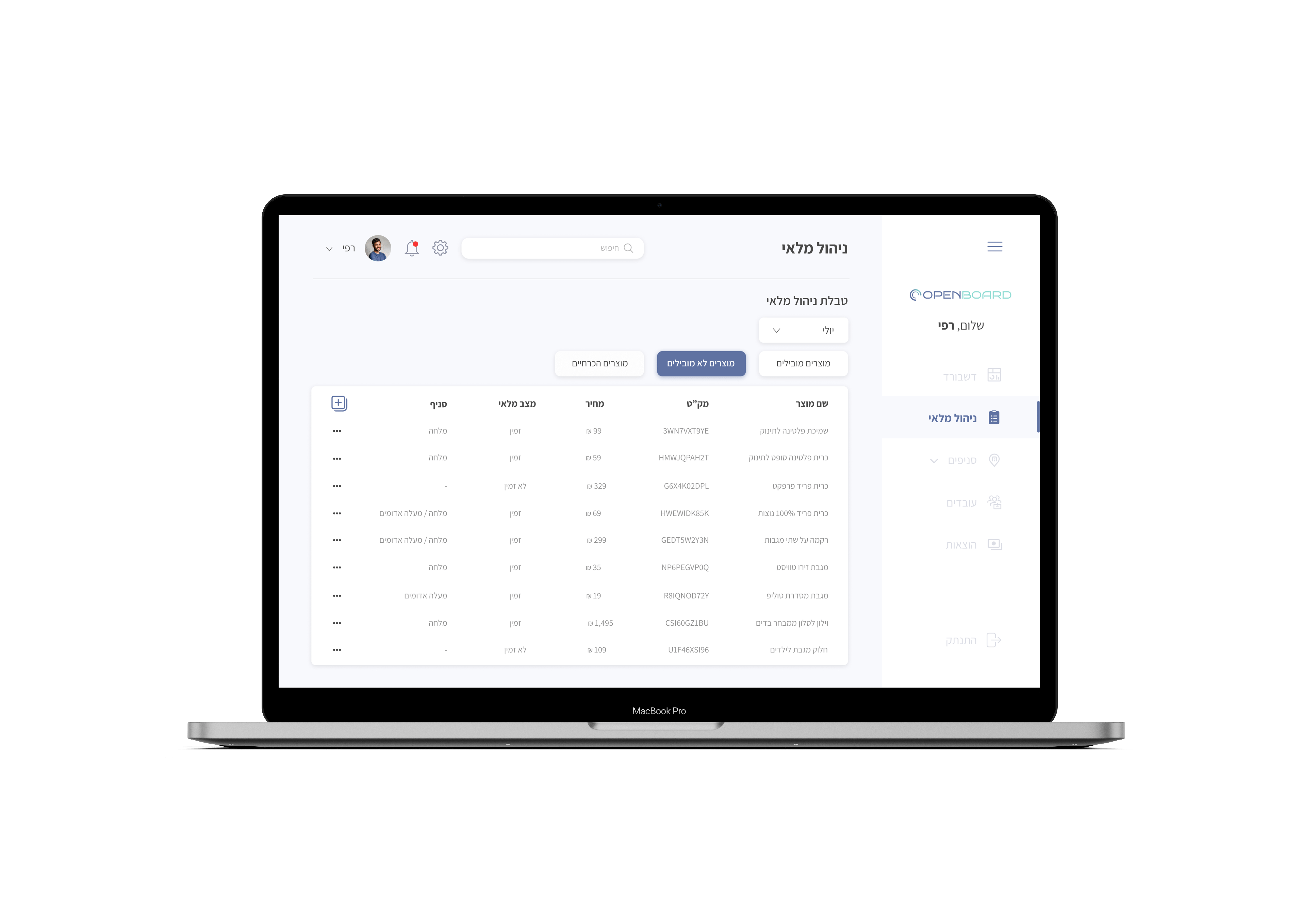
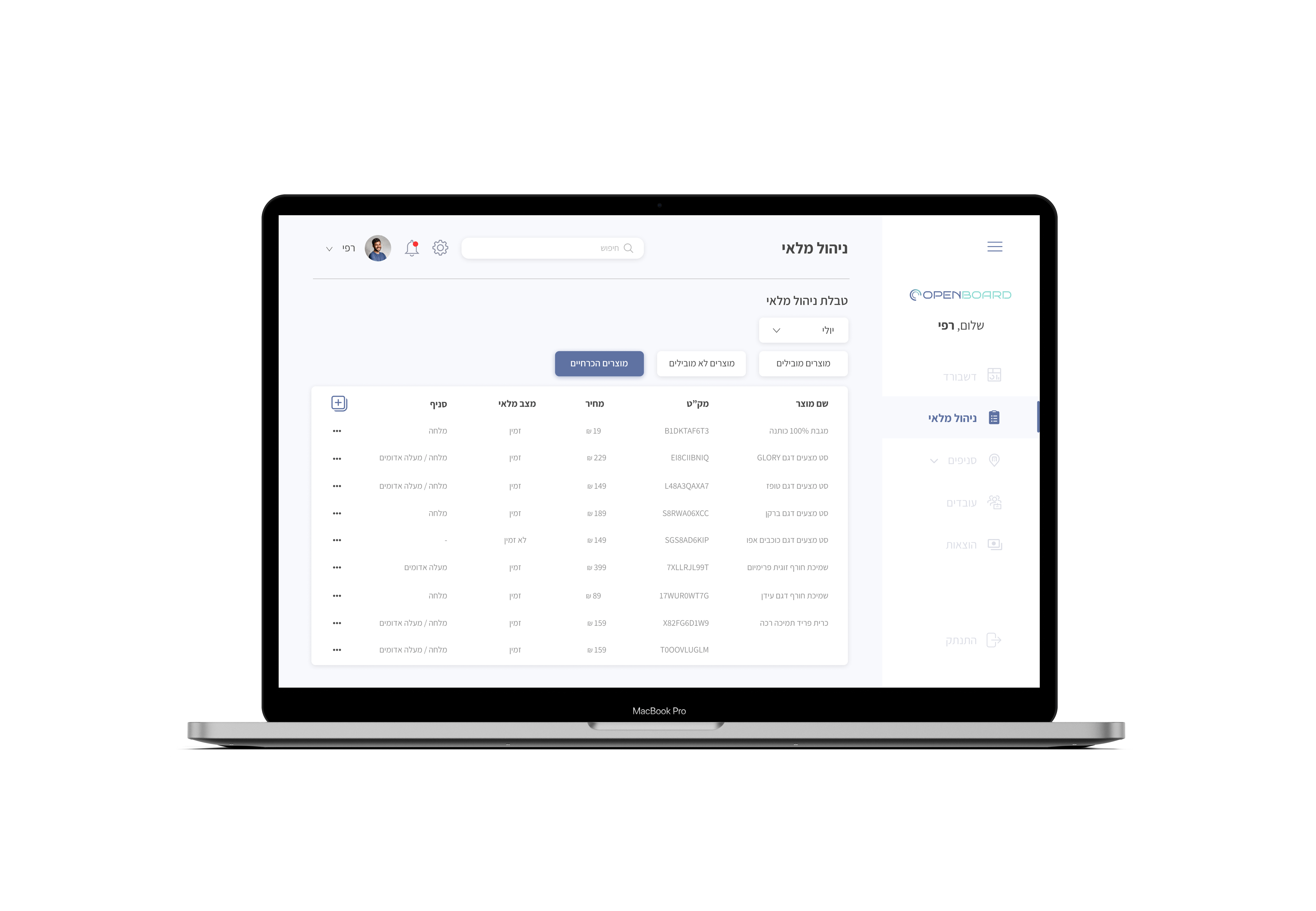
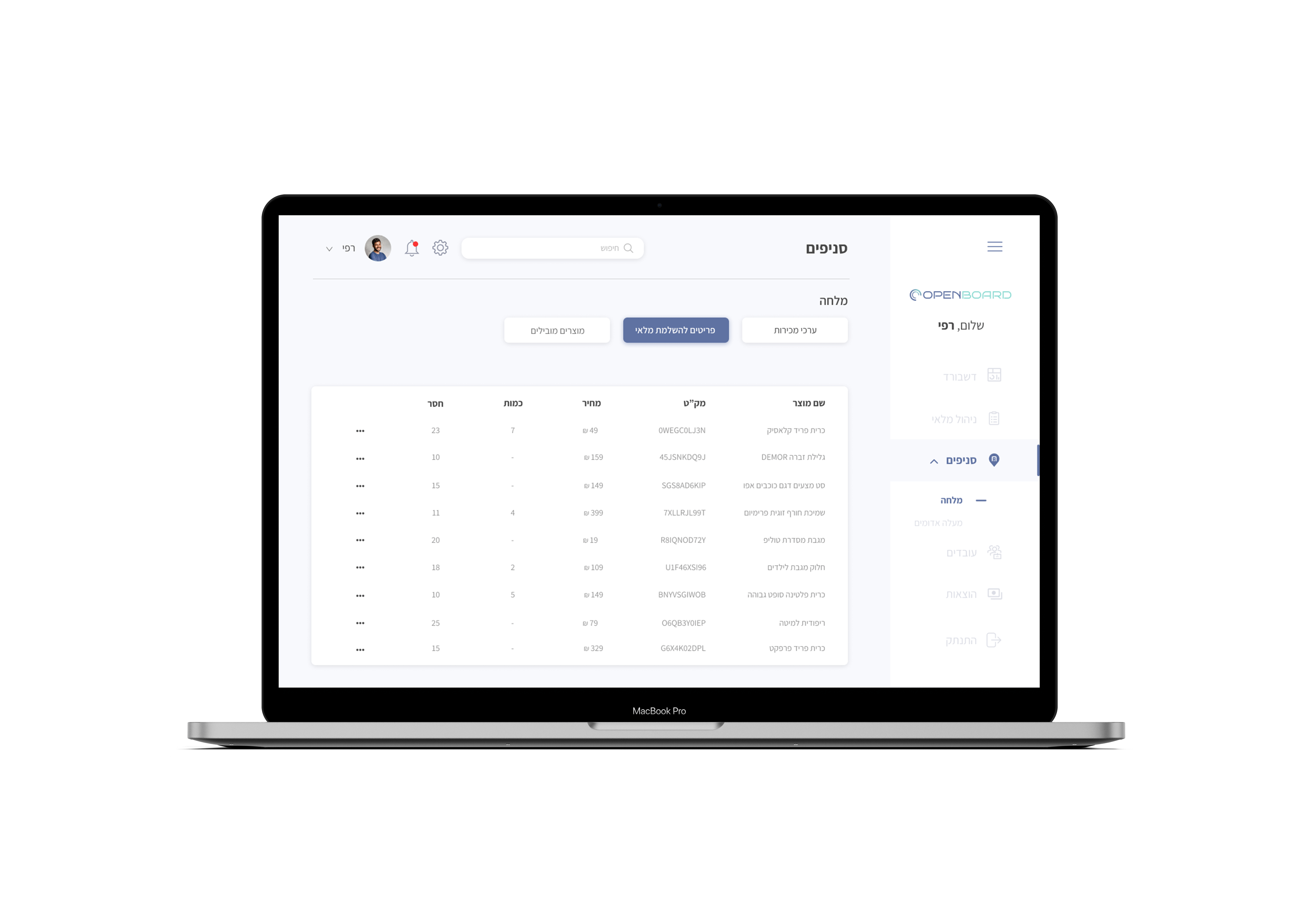
Inventory Management
In the Inventory Management category, managers can keep track of the leading and least leading products, products needed by the business as well as control the inventory management at all branches.
Branches
In the branch category, managers have the option to switch between the various branches and keep track of sales data, revenue, inventory management for the branch, and more.
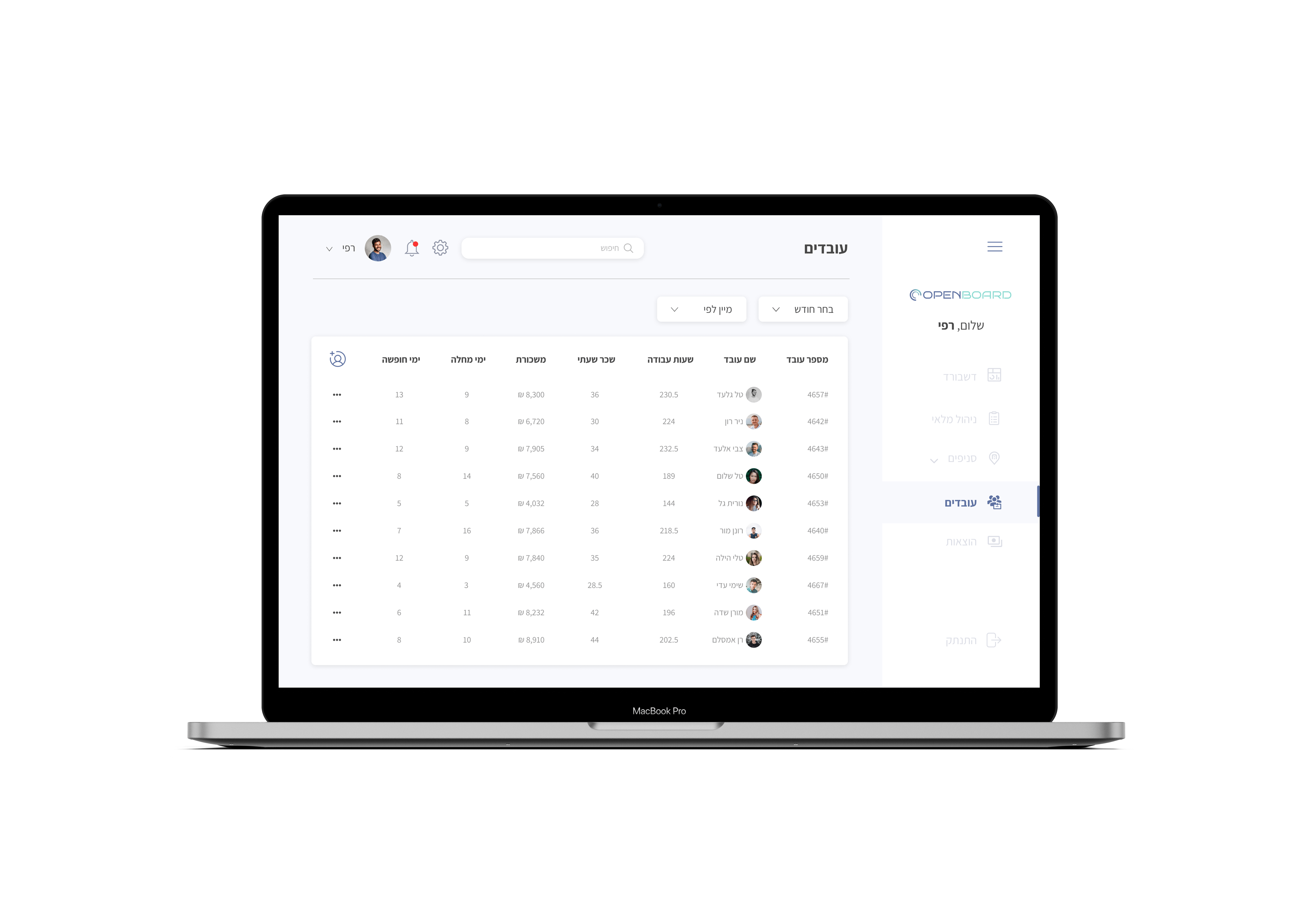
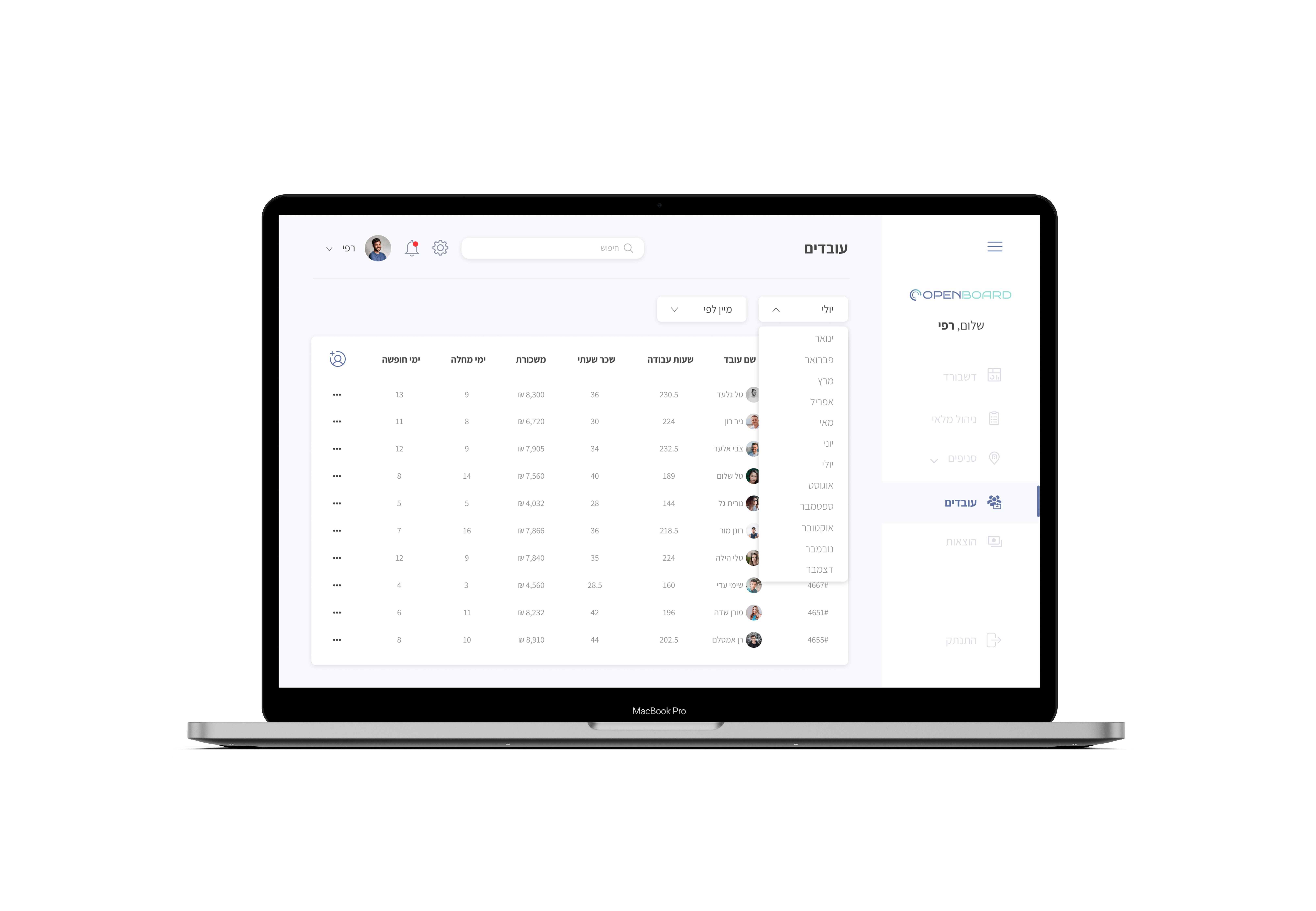
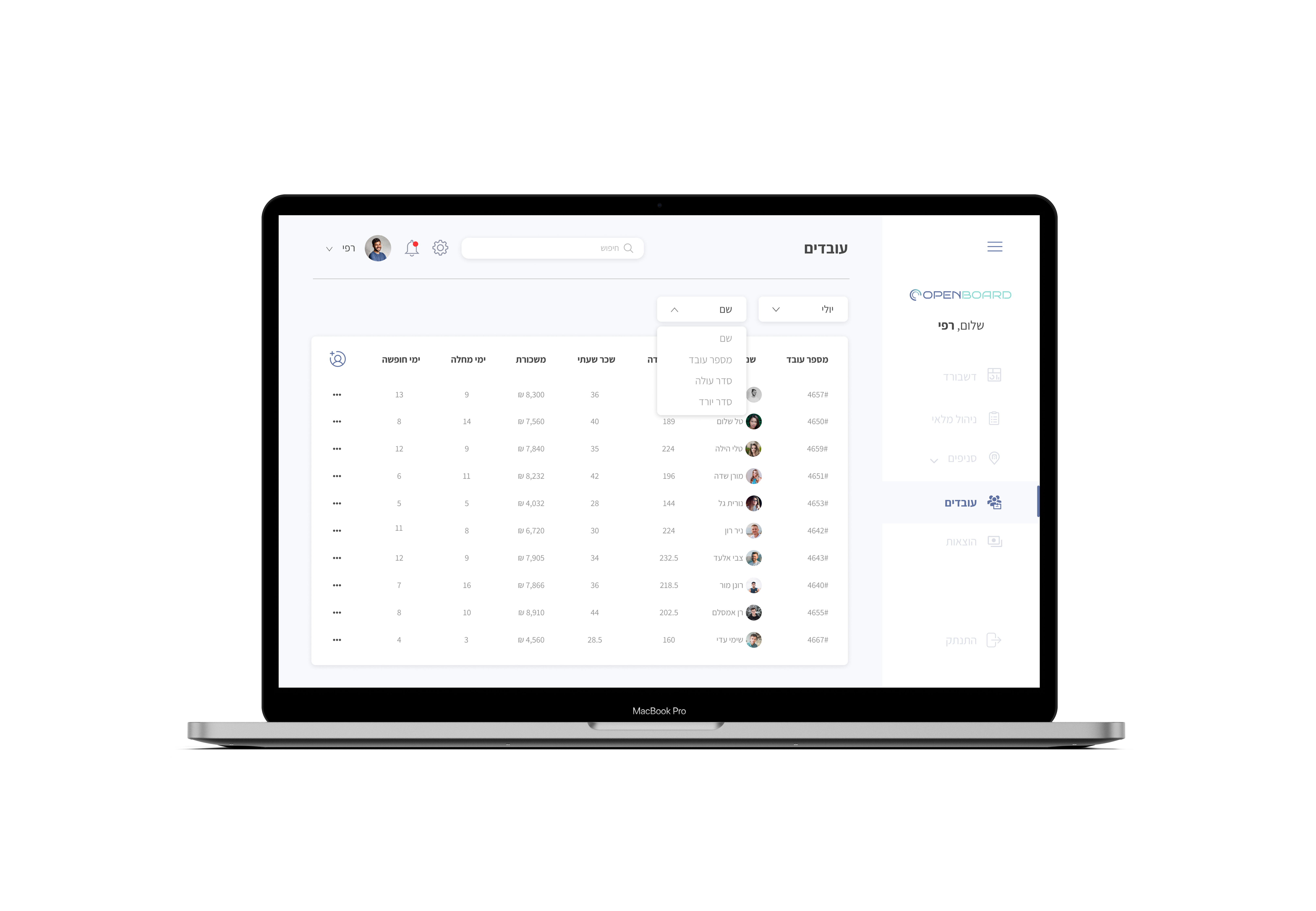
Employees
In this category, managers can navigate between the different months and filter according to their preferences in order to follow and view employee lists.
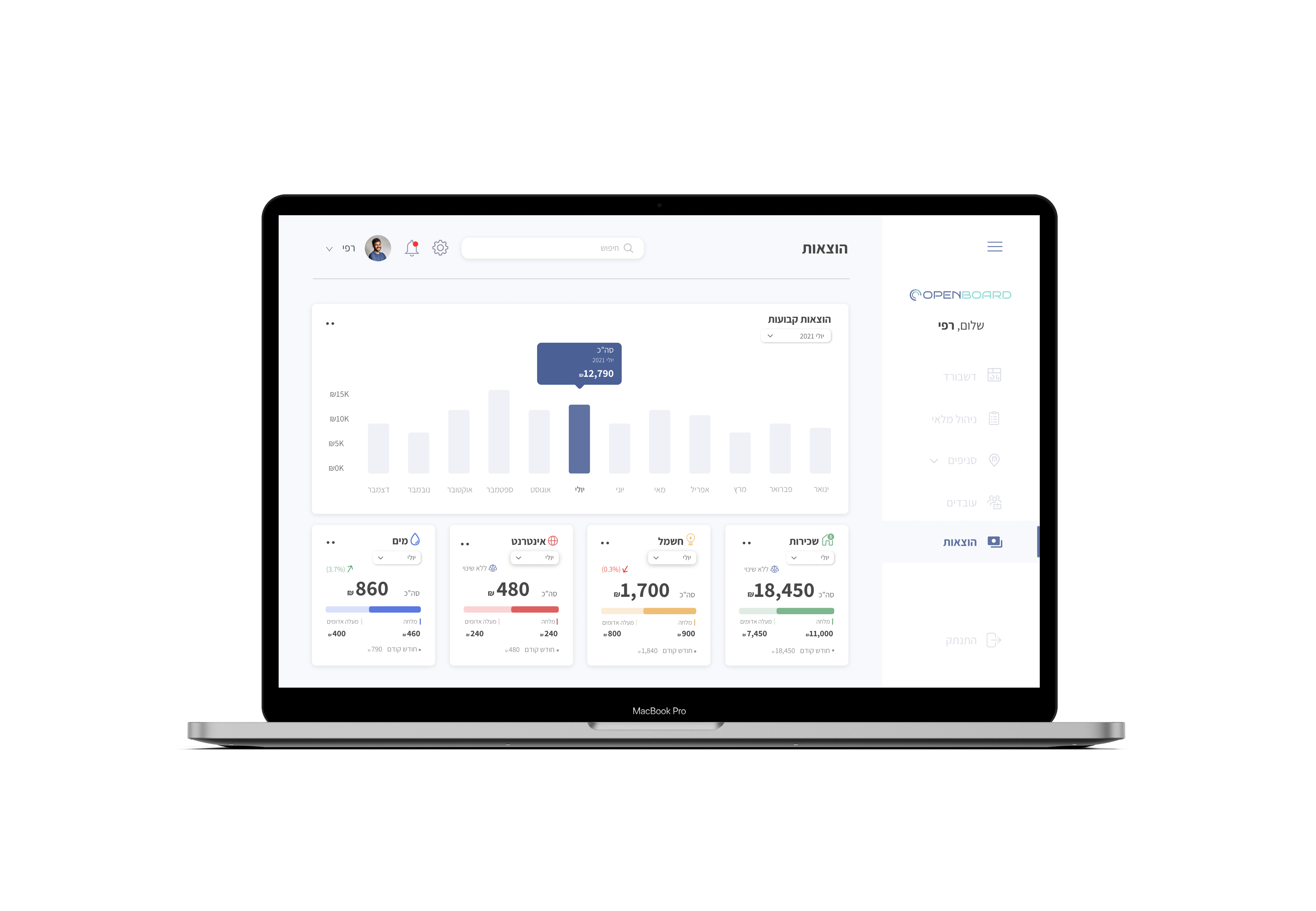
Expenses
In this screen, managers can track and manage their monthly expenses for the network branches.
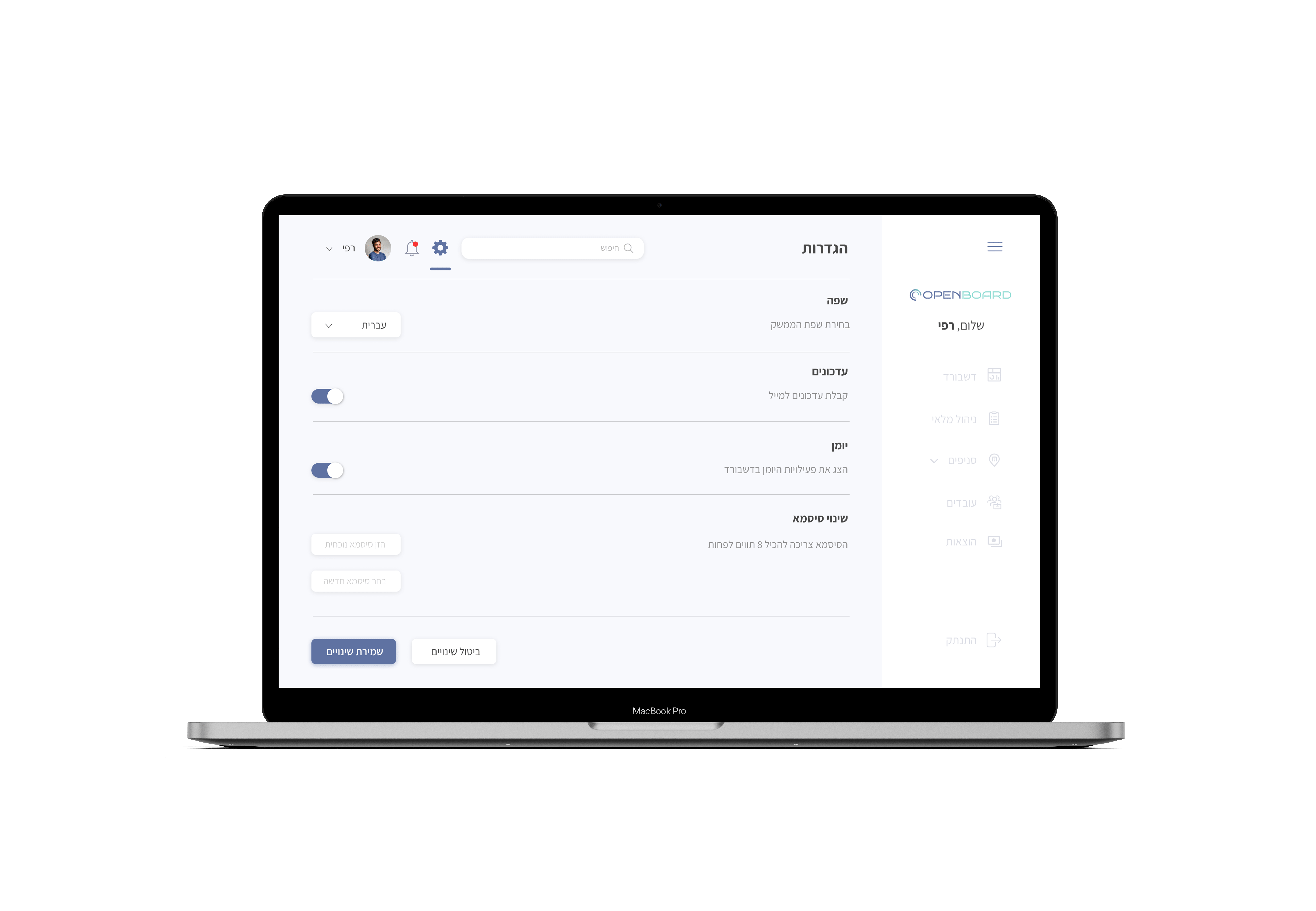
Settings & Notification
In the Settings screen, managers are given the option to configure and select their interface settings and preferences.
Next to the settings icon, there is a system updates icon that is relevant to managers.